More natural light to feed our productivity, creativity and well-being.
A 2018 Cornell study found that optimizing natural light in office settings dramatically improves employee health and wellness, equaling happier workers and higher productivity. Meanwhile, Human Spaces research illustrated that natural elements such as greenery and sunlight return a 15% gain in well-being and creativity.
Luckily for Wray Ward staff and visitors, the new office has plenty of sunlight, with glass on three sides and VELUX® Sun Tunnel Skylights for areas including the on-site Studio and first-floor rooms in the center of the building.
The Studio also has giant, sliding garage doors for copious natural light (or, if a shoot calls for it, complete blackout) as well as easy offloading. Meanwhile, because everyone has unique needs, the agency’s digital developers have their own space designed to help prevent screen glare.
Fresh air for healthier bodies and minds.
Countless studies have shown better air ventilation systems and access to fresh air increase energy levels and productivity while decreasing employee absenteeism. Healthier environments. Vitamin D (sometimes called the sunshine vitamin). Elevated mood. Improved concentration.
Long before COVID-19 considerations touted the benefits of being outdoors, our plans included lots of fresh air access — for indoors and out. Those early decisions will benefit Wray Ward in our new office.
That’s because 2317 Thrift Road has no shortage of fresh air, with large venting skylights from VELUX over the lobby in addition to the fixed skylights and Sun Tunnel skylights in other areas. Our staff will also have easy access to great outdoor spaces such as a roof-deck amenity.
An adaptive reuse project that combines the best of the old with new.
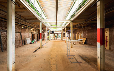
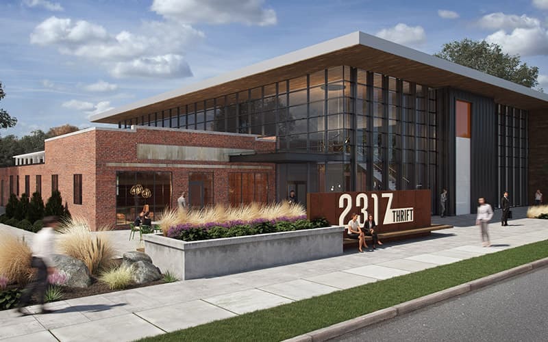
Our Thrift Road home preserves priceless history, blending a renovated 1950s industrial structure with a new, two-story attached building. It sustains the natural patina and character of the space without going faux.
Charlotte’s FreeMoreWest neighborhood is at the heart of the preservation movement, and Wray Ward will fit right in. The building has a large footprint that vertically and visually links the old and new structures. It’s no vanilla box (design speak for cookie-cutter office space). Instead, imagine a slick, white envelope with punches of the agency’s signature orange, all grounded in the original building’s authentic, gritty, raw soul.
Colors, patterns and textures that make up the essence of a stimulating office space.
A gift from the fashion world, color-blocking combines solid colors from different sides of the color wheel for a fresh look that boosts the mood and stimulates the mind.
Wray Ward is a creative company, so it stands to reason that our office should have quite a few layers of color. But Runkle and his team at Redline took this concept to another level, integrating bright white with pops of color throughout the building. Then, they added graphic wall coverings, bold textures in performance fabrics, and even backlit, perforated metal wall panels. This blend of clean, vibrant color with more geometric or abstract elements brings the space to life for an office that’s anything but dull.
The chance to fearlessly forge on — together.
Resilience means the ability to quickly recover from difficult circumstances. Put more simply, resilience means “toughness.” After watching our staff and clients continue working apart yet together so well through extraordinary challenges, I can only imagine what we’ll be able to do when we’re back under the same roof next week.
As much as our new home taps into contemporary office design trends, it’s also a home built to withstand the test of time. It’s an exciting new beginning, built atop a time-tested foundation. And because we live and breathe “home” working with our clients each day, I’m inspired by the chance to channel their products, their principles and their vision into our own space.
Welcome home.


