Digital Platforms
In today’s hyper-digital, always connected world, the customer journey is more complex than ever before. Successful brands focus on creating a seamless experience that supports the customer and connects all of the dots on their journey.
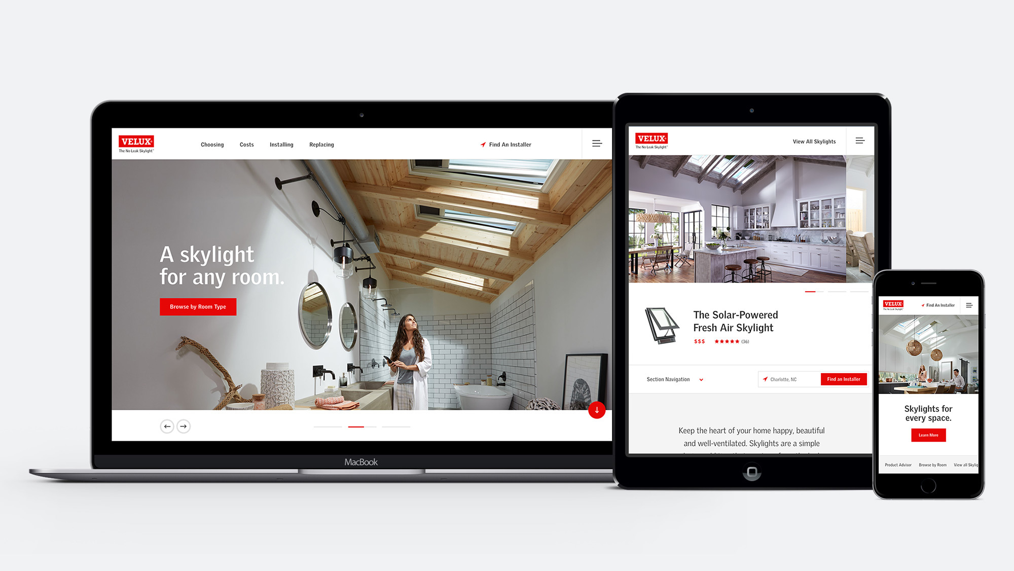
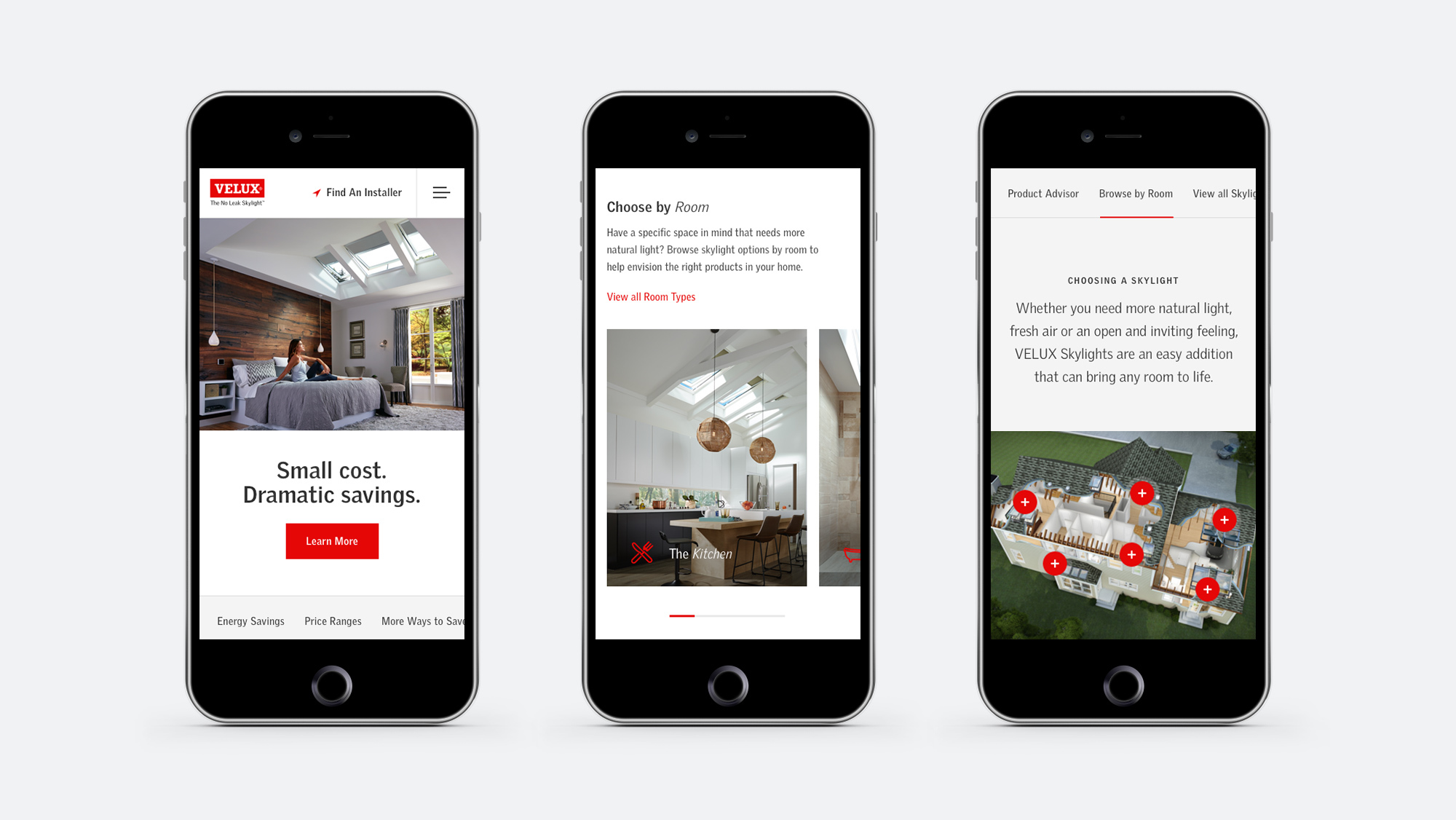
Enter whyskylights.com. This responsive, content-rich site from VELUX skylights educates consumers on the aesthetic, health and energy efficiency benefits of bringing natural light from above into their homes with skylights. The site, designed to answer key questions about skylights, leads homeowners down a path to purchase skylights for their home. It aids the entire customer journey, from inspiration and education to conversion and customer support.
Whyskylights.com has been a huge success since it launched in 2014, but like any website, it needs an occasional makeover. That’s why we set out to make a great site better. Here are some of the key things we learned along the way.
How to know when it’s time to redesign your website
At Wray Ward, we continuously optimize digital platforms and campaigns, employing strategies like user testing to better understand how visitors interact with a website. In 2017, we saw a great opportunity to take all the lessons we’d learned about whyskylights.com and transition the site to a new content management system (CMS), allowing us to operate more efficiently and make the site more adaptable to change. Craft is an incredibly flexible CMS that makes life better for everyone, from developers and content managers to site owners and their customers (the site users).
How do you know when it’s time to redesign your website? For VELUX skylights and whyskylights.com, it all came down to a desire for a more flexible solution — a platform that would allow VELUX to publish content more quickly, evolve their online product offerings to keep up with smart home automation and other home industry trends, and connect more seamlessly with VELUX’s other digital properties.
Now, VELUX’s whyskylights.com consumer site and skylightspecialist.com five-star and three-star preferred installer microsites are connected — built in a way that both small and global updates can be rolled out seamlessly to all properties.
How to make a successful website work harder for your brand
Whyskylights.com is a great educational resource for consumers interested in bringing more natural light into their home, but it’s also a powerful lead generation tool for VELUX. The website redesign coincided with VELUX’s decision to use HubSpot, a customer relationship management (CRM) tool that helps companies attract visitors, convert leads and close customers. Today, HubSpot allows VELUX to not only grow their leads, but also improve the quality of those leads and follow up on them in a timely, deliberate manner, ultimately increasing sales.
To achieve our goals and our client’s goals, we used a methodology called atomic design, which is becoming increasingly common as design teams face more complex challenges and as digital ecosystems extend beyond websites. Atomic design makes web development more efficient, faster and more effective. As an added bonus, it also makes it easy to maintain consistency and performance as sites evolve or new properties are created — aspects we knew applied to whyskylights.com.
The redesigned website is also a product of the agile development process, which came about as a way to get end products to owners and end users more quickly while cutting out unnecessary hurdles and roadblocks. The agile process always puts the site owner and end user first while increasing adaptability and creative flexibility.
Whyskylights.com is still a content-driven site, and the current platform makes it easier than ever to shine a spotlight on that content. For example, if a blog post tells the story of a homeowner who installed VELUX skylights to bring fresh air and natural light into their bonus room, the new framework makes it easier to connect that story to a related product, such as the VELUX No Leak Solar Powered “Fresh Air” Skylight, which encourages the user to take another step along the customer journey.
Finally, this project gave us a chance to evolve the brand’s digital design system, meaning VELUX can now mold and shape its corporate look and feel to appeal to different audiences or achieve different goals. As a result, everything becomes more consistent, from tone of voice to look and feel and customer interactions. This was important for VELUX, because whyskylights.com, while successful, had a different look and feel from the company’s corporate and trade-facing websites. Beyond the logo, the sites lacked a common design language for the consumers, installers and other audiences who are interacting with each other at different parts along the customer journey. The whyskylights.com redesign quickly led a new charge for brand consistency.
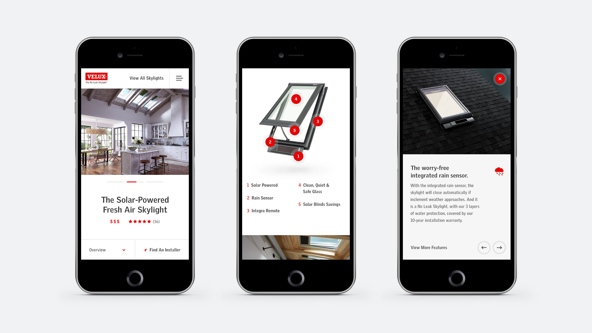
Some early results for whyskylights.com
It’s still early, but we’re excited about what we’ve seen thus far. Heat map tracking and user testing pre- and postlaunch show that whyskylights.com is working as intended. People are engaging with the new design and content presentation in a way that helps connect all of the dots, from inspiration and education to conversion and customer support. The site has already helped increase qualified leads, which should result in more sales.
Even if your current website is performing well, the digital landscape always leaves room for improvement — opportunities to make life better for your customers, which makes life better for you. And that’s a goal worth working toward, no matter what problem you want to solve or story you want to tell.

