Creative
Digital Platforms
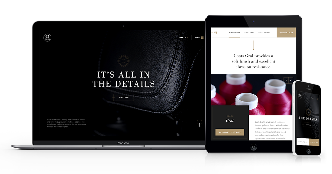
About four years ago, a guy named Brad Frost coined the term “atomic design.” If you’re a developer, or if you’ve spent any time around digital design teams, you’ve probably at least heard of it. The approach is gaining popularity as design teams face more complex challenges and as digital ecosystems extend beyond websites. We’ve used it for previous projects, such as this site for Coats Speciality, the world’s leading industrial thread and yarn manufacturer.

But what exactly is atomic design, and how does it work?
What is atomic design?
Since Frost came up with the idea in the first place, I’ll start with the definition he uses:
“Atomic design is a methodology composed of five distinct stages working together to create interface design systems in a more deliberate and hierarchical manner.”
Here are Frost’s descriptions of the five stages that make up atomic design. I like these because they’re clean and easy for everyone to understand, from junior designers and lead developers to stakeholders with little digital experience.
- Atoms are the basic building blocks, just like you learned in high school chemistry. Applied to web interfaces, atoms are HTML tags such as form labels, inputs and buttons. Atoms can also be more abstract elements such as color palettes and fonts and even more subtle aspects of an interface such as animations. Together, atoms make a great reference tool, because they provide an across-the-board view of all of your global styles.
- Molecules are groups of atoms bonded together, and they’re the smallest fundamental units of a compound. Molecules take on their own properties and serve as the backbone of our design systems. They aren’t too useful on their own, but together they can do some pretty powerful stuff.
- Organisms are groups of molecules joined together to create a relatively complex, distinct section of an interface. When we get to this stage, we can see the final interface beginning to take shape. Organisms can consist of similar and/or different types of molecules. For example, a masthead organism may contain diverse components such as a logo, primary navigation, a search form and social media icons. But a product grid organism may contain the same molecule (maybe with a product image, product title and price) repeated over and over again.
- Templates consist mostly of groups of organisms stitched together to form pages. When we get to this stage, we can start to see our design system coming together and our layout in action. Templates are concrete, and they provide context for all of those relatively abstract molecules and organisms. The design can evolve from wireframes to visual design comps and/or prototypes.
- Pages are specific instances of templates with actual content. This stage has the highest level of fidelity, and it’s essential. This is our chance to test our design system’s effectiveness. Viewing everything in context allows us to loop back to modify our molecules, organisms and templates to better address the real context of the design. Here, we can also test variations in templates.

How does atomic design benefit digital teams, site owners and end users?
Atomic design is our preferred approach to designing websites from the ground up because it:
- Provides a clear methodology for crafting design systems. Atomic design makes it easy to create a style guide. It removes the guesswork without killing creativity. It’s a mix-and-match model that gives digital designers and developers a menu of content assets, meaning they don’t have to start from square one every time.
- Makes development more efficient, faster and more effective. Atomic design and consistent code go hand in hand. Remember, using atoms as the building blocks for site creation is the basic idea behind atomic design. This makes it less likely that a developer will create many atoms for a similar thing. Instead, they can simply look through a list of existing atoms and tweak them to create whole new atoms. Atomic design also helps prevent duplicate tasks. That’s because it’s easy for us to see which components are being used for different parts of the site, meaning we’re less likely to write duplicate code. Finally, atomic design allows for easier and faster prototyping. Having a list of atoms before we start creating the site means we can mock up pages easily and quickly. All we have to do is pick and combine the required elements for a page, then customize and refine the mock-up for the final site.
- Keeps everyone on the same page. Just like writers each have their own voice, designers each have their own style. But atomic design consolidates everything so that we’re all speaking the same language. It doesn’t kill creativity. It just means that even if the lead designer is unavailable, anyone can easily step in and execute what’s needed without missing a beat.
- Allows site owners to maintain consistency and performance as their website evolves or as new properties are created. Atomic design makes it easy to refine, add or remove content and features. Websites should be fluid — they’re never really “done.” But it’s a lot easier to make changes throughout the life cycle of a website if you use the right building blocks in the first place. Atomic design allows teams to simply swap out one atom, molecule or organism at a time and even apply those tweaks across the site, instead of doing a major overhaul. Plus, if a component of the site is underperforming, we can address it without touching the rest of the design system. Maintenance is not only cheaper and faster, but it also yields a more effective end product.
Atomic design doesn’t just make life easier for design teams and stakeholders — it makes sites better. And that’s a goal worth working toward, no matter how the landscape continues to change.

