Marketing Insights
During our latest digital huddle, we reviewed a handful of home decorating apps, but there was just one that stood out. For this review, we are going to take an in-depth tour of the app, AutoDesk Homestyler, which we felt had a wide range of potential applications for homeowners, decorators, realtors and home product manufacturers and retailers.
Getting Started

After firing up the app, we were presented with a few options to get started. There is the obvious choice—the "Create a New Design" button—but there are additional options including a choice to review the "3D Design Stream" of shared rooms, the product catalog, “Homestyler Help” and a link to check out 2014 trends.
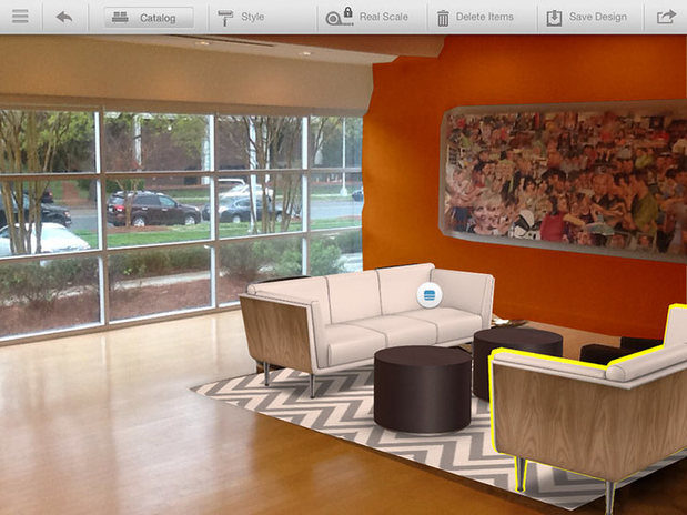
We began by creating a new design. And here’s the fun part—we used the lobby of our office as a test subject.
Taking a photo of your room

To create a new design, the app includes the option to take a picture, select a picture from your camera roll or use an empty room. It is recommended that the photo include at least two walls, the ceiling and the floor. This helps with mapping the perspective and scale by identifying the corners of the room.
Getting it orientated
Once the photo has been taken, the next step is to establish the depth and perspective of the room. The app uses a three dimensional grid tool overlay to suggest the edges of the walls, ceiling and floor. Adjusting the room takes a little practice, but once you get the hang of it, the grid overlay is very intuitive and easy to align with the shape of the room.
One helpful feature of this step is that the app attempts to "auto detect" the corners of the room. This feature positions the overlay close to where you need it to help minimize the amount of adjustments. In our experience, we had to adjust the overlay slightly, but it was very close from the start.
The next step is to determine the scale of the room by providing measurements such as the length and height of walls. This "real scale" will allow for the app to change the dimensions of the elements we add to the room in order to create a more accurate depiction of the final product.
Selecting a wall color
Our lobby has white walls, so we decided to add a little color to one of the walls. To select the wall, the user must first "paint" a mask on the wall. The app uses a masking technique that allows you to fill in the area you want to change. If you use the paint bucket option, it will attempt to select the rest of the wall you have already started “painting.”
While the masking of the room started well, the app tended to bog itself down when the masking becomes more complex. In addition, the more steps you take to mask the room, the more likely the app is to run out of memory and not be able to complete the mask.
However, once the mask has been created, changing the wall color is really simple. The app employs color controls to adjust brightness and color blending; the controls are easy to use and help tweak the paint color to the user’s exact preference.
Adding furniture
Once we painted the walls orange, we decided to redecorate the lobby with new furniture. Through the product catalog, users are presented with a wide range of furniture options from which to choose. The catalog includes furniture, accents, art, curtains, books, etc., and products can be sorted by type of room, e.g. living room. Each product from the catalog can be added to your design and users can link back to a webpage to learn more about the product.
Placing the furniture into the design was a snap. However, because we kept the "real scale" option selected, we were limited in the rotation and placement of the furniture. We also struggled with the ability to control which items were on top of each other. For example, when we tried to add accessories to the new coffee tables, the accessories would appear "behind" the table instead of on top of the table.
Rating
As with any app today, the ability to share your design is a must. Luckily, this app provides users with the option to share the design via email, save it to a profile or share it with others as a public room in the 3D room stream.
We give this app a rating of 3.5 out 5.
What would make this app better?
- Wider product selection
- The ability to build rooms in 3D
- More refined masking controls, zooming and the ability to alter brush size during “painting”
- Search option and color sorting to aid product selection
- Layering to change the z-index of the furniture
Overall, this is a very solid app for homeowners, amateur decorators or even realtors or home staging professionals to help envision a space before committing to a product. For home category product manufacturers—getting your products into this app’s product catalog could be another step toward getting your product in the hands and homes of the consumer.
Want to make sure you don't miss any of our blog posts? Sign up for our monthly recap email.


